
The Challenge:
This was a self-directed case study to redesign the Paytm Home Screen based on research with its users.
Digital payments are the future, and the success of India’s developing economy is heavily reliant on platforms like Paytm, one of India’s leading online payment services. Unfortunately, Paytm’s app does not reflect this future-forward vision with an unintuitive app that doesn’t capitalize on the opportunity for seamless transactions, security, and transparency.
Highlights:
- Conducted research to understand user pain-points, feature hierarchies, and areas for growth; modeled these insights and journeys using flow diagrams
- Prototyped wireframes in Sketch
- Challenged myself to focus on the app’s visual design and aesthetics while honing skills in Adobe PSD and Illustrator.
The Approach:
I set out to change Paytm’s image by remodeling the app’s Home screen – also the first exposure consumers have to the service. The entire experience I designed was guided by intensive user research. Indeed, the amount of time I spent designing the screen at the end was relatively low compared to the other steps in the process.
To begin with, I simply observed users as they opened the app and attempted to perform any task. Some of the people I worked with joked that they felt like lab-rats under observation, but the process yielded many insights:
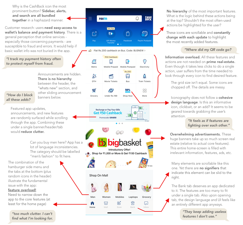
All these insights centered around one fundamental truth that Paytm seemed to be ignoring: people don’t want to spend time browsing through their wallet app. People want a tool that gets the job done as seamlessly and quickly as possible.
As I detailed every observation, I began to develop a user flow model that tracked common journeys taken within the app. 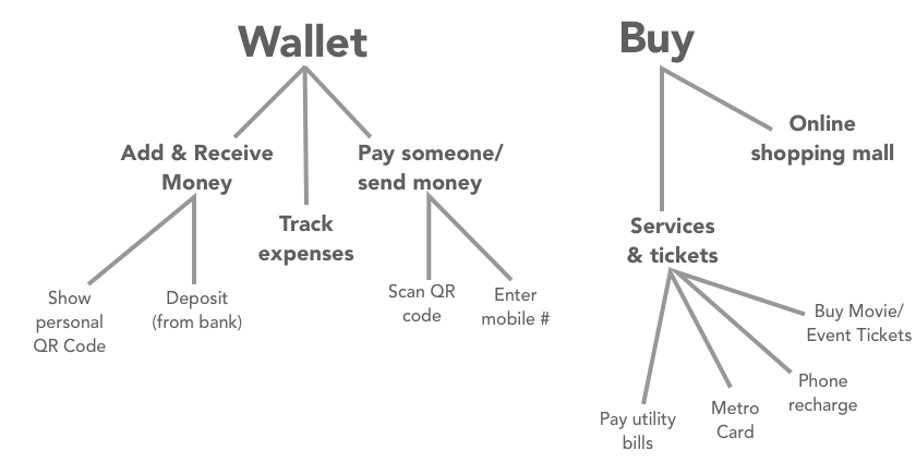
To visualize my findings and organize what I found to be the most widely-used features, I attempted to model the user journey under the simplest hierarchal structure possible. This was broken down into the core features people actually opened the app for. My takeaway? The Home screen should guide users towards relevant features thereby making it easier to accomplish tasks.
Initial Prototyping:
I aimed to combat how overwhelming the app had become due to its overload of features. My first instinct was to strip down the app and boil it down to its core; the perfect solution seemed to involve unbundling features into distinct applications.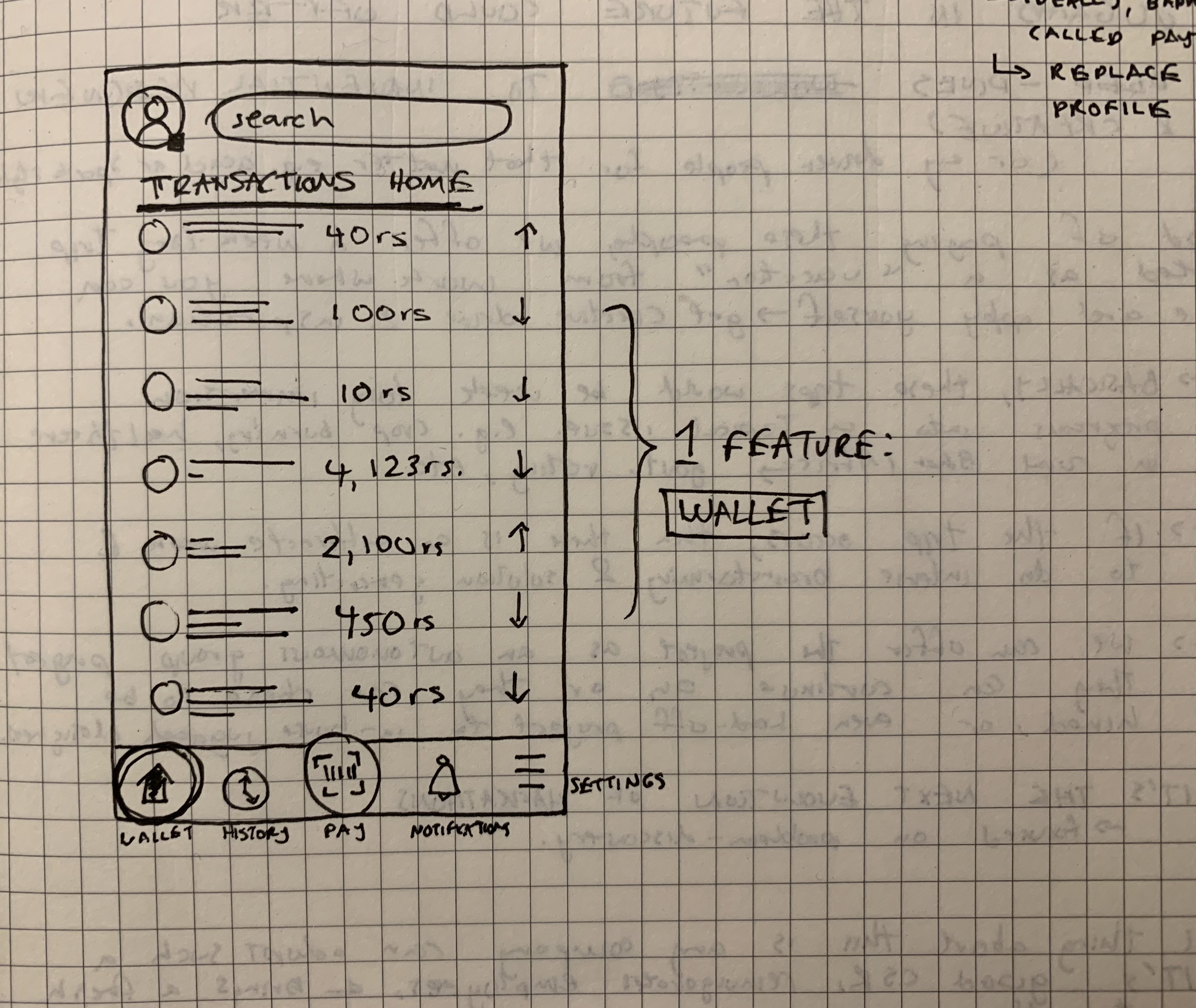
Yet, this strategy was flawed.
Many of the app’s features are premature products. By including them in the main screen, Paytm aims to attract the user-base it maintains on its core service to its other platforms. In the hopes of diversifying its revenue streams, the company is throwing features at a wall hoping something sticks. The strategy isn’t even flawed; Paytm Mall, for example, gained a lot of traction this way.
This meant I had to adjust my approach to allow Paytm to pursue this business strategy. The challenge would be to achieve a simplified user experience while retaining access to infant features like selling movie tickets, travel booking, e-commerce, etc.
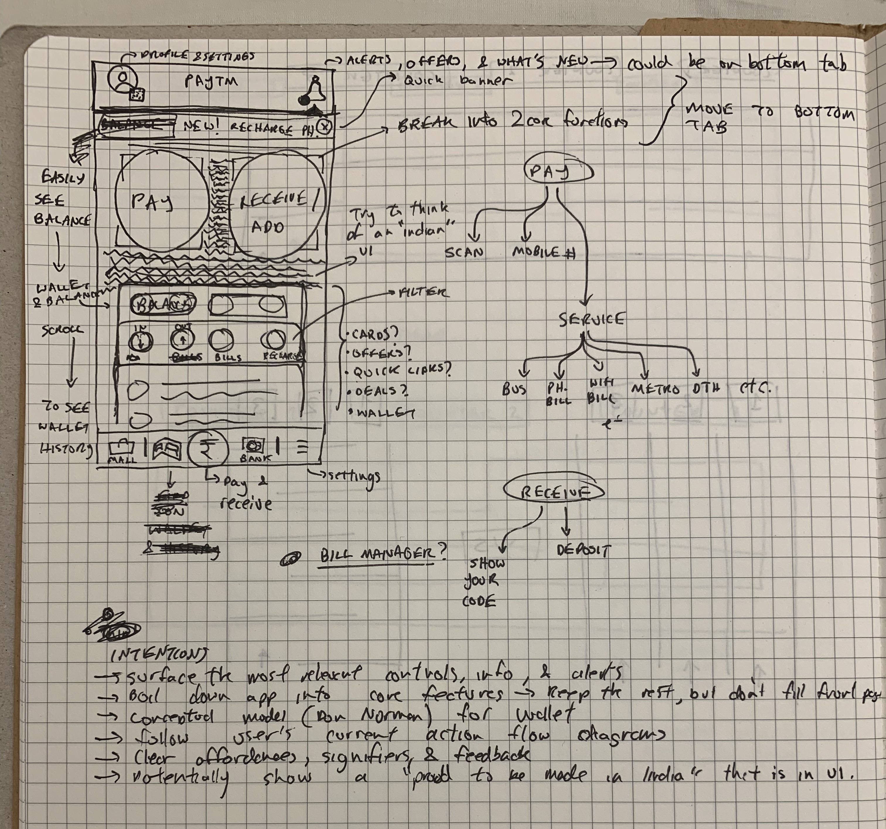
Although I would have loved to just split up the app, I created a wireframe that guides the user towards features and surfaces options when relevant.

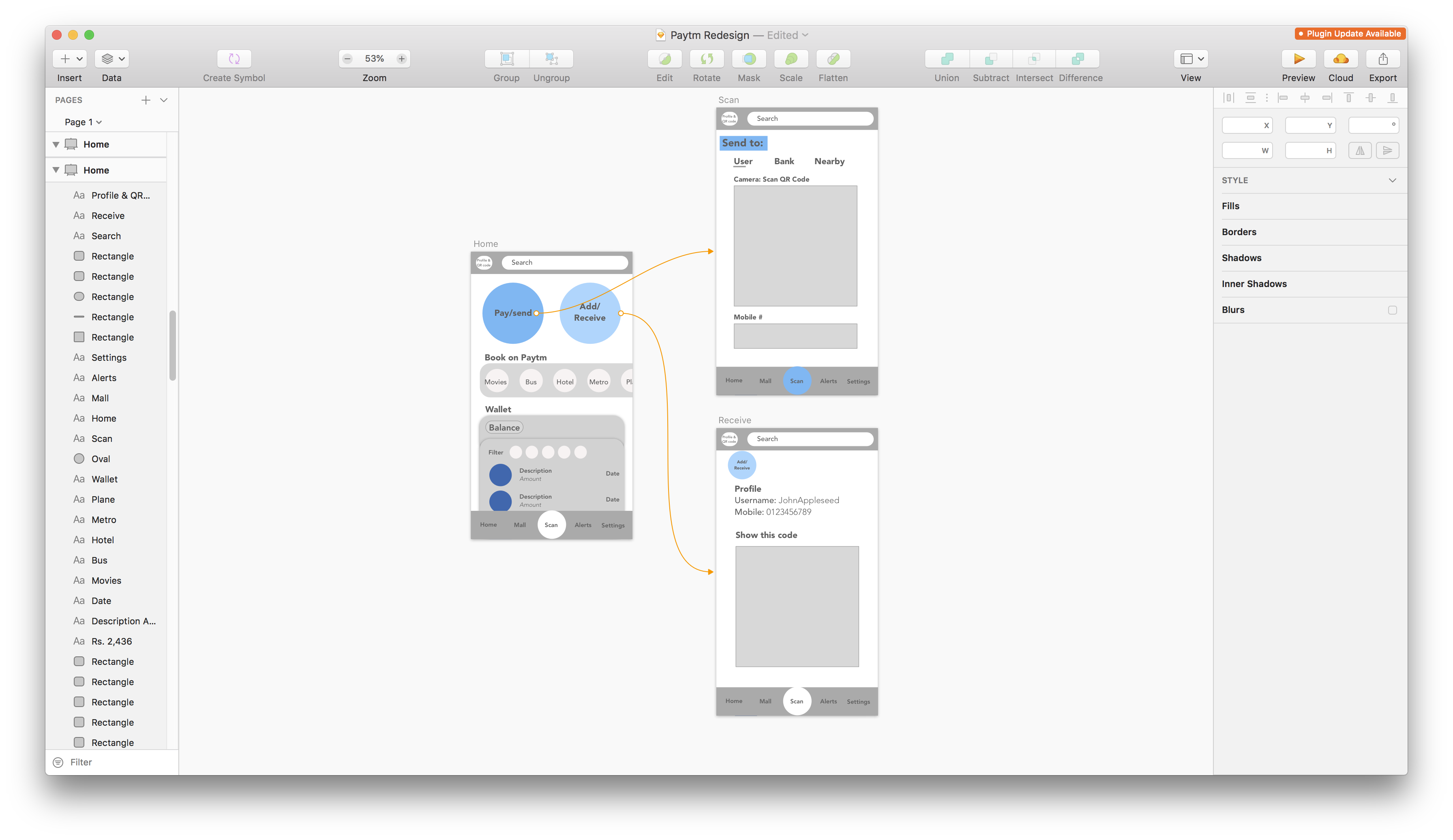
The Solution:

Upon opening the app, the user is greeted by two big buttons that make it easy to access the app’s (and any wallet’s) two core features.
Scroll down and the user can get glimpses of the other things they can do on the app. Notice that the swipeable categories are easily distinguished, and the user is not bombarded with every single feature from the moment they open the app. Meanwhile, new updates and features are compiled under the alerts tab to clean up precious front screen real-estate.
Below, the user finally has easy access to their wallet. The goal here was to build trust through a transparent experience. An easy wallet viewing experience makes transparent the information users hunted around the app for (like the actual wallet balance itself). It also adds features to filter the history of transactions by credits and debits. Users can even view more details on a transaction or report an incorrect listing by tapping on any payment.
Finally, I wanted to appeal to the visceral reactions of users by focusing on an interface that was more than just utilitarian. Since I’ve tended to not emphasize visual design as much in the past, I thought it would be a fun personal challenge to do so while squeezing more learning out of Adobe Illustrator, Photoshop, and Sketch.

From the restitched design language to the precise, modernist iconography, the Paytm app is coordinated down to the final touch and can set the bar for high-quality apps that are made in India.
I’ll leave you with some branding I played around with on Illustrator and PSD.


