Description: Sova Streamlines paperwork for small elderly care facilities so nurses and administrators can save time and focus on patient care.
Role: Product manager
Skills: User research and problem discovery. UI/UX design, Bootstrapping. Rapid prototyping. Pitching.
Design Question: How might we help older adults lead more fulfilling lives?
The number of adults over 65 needing some form of long-term care in their life is expected to surpass 78 million in the US alone. Yet current infrastructure is not growing fast enough to support demand, and the facilities currently catering to this population are understaffed and overburdened.
As part of USC’s Student Start-Up Incubator, Lavalab, my team and I decided to explore the problems of geriatric care after we realized how no one is designing local and sustainable solutions for long-term care.
User research
As we immersed ourselves into this space and talked to older adults, we realized generally lower digital literacy rates, cognitive and physical impairments, and heavily routinized schedules led to a higher adoption barrier for current consumer-facing products. We fell into this same trap with our initial product hypothesis, but our approach shifted after visiting small scale geriatric facilities. The insights we gathered made us realize the infrastructure to support older adults already exists, but that operational inefficiencies limit their potential impact.
Narrowing scope


By learning how small-scale elderly health facilities function, we quickly began to understand that bottlenecks arise in the first step of the process: the visit with the treatment nurses. When a patient comes in, treatment nurses are the first ones that look them over and check for any bruises, scars or wounds. With each wound they find, they have to fill out 7 forms (if someone comes in with 7 wounds, that means 49 pieces of paperwork). In fact, they spend a minimum of 1.5 hours a day just filling out paperwork. The paperwork burden placed on treatment nurses shifts the focus away from patients and buried patient information leads to neglect in care.

Due to a moral obligation to treat patients, nurses resort to filing backlogged paperwork at home. Observing nurses and hearing stories like these gave us confidence that this problem was indeed a valid target to focus on. We further heard stories of misdosages, conflicting medications, and erroneous patient history, which can have devastating consequences.

Revised Design Question: How might we help nurses provide more effective care through accessible technology?
These forms are unintuitive, distracting to nurses, and result in backlogs of patients. When designing our solution, we spent a lot of time understanding nurses’ workflows.
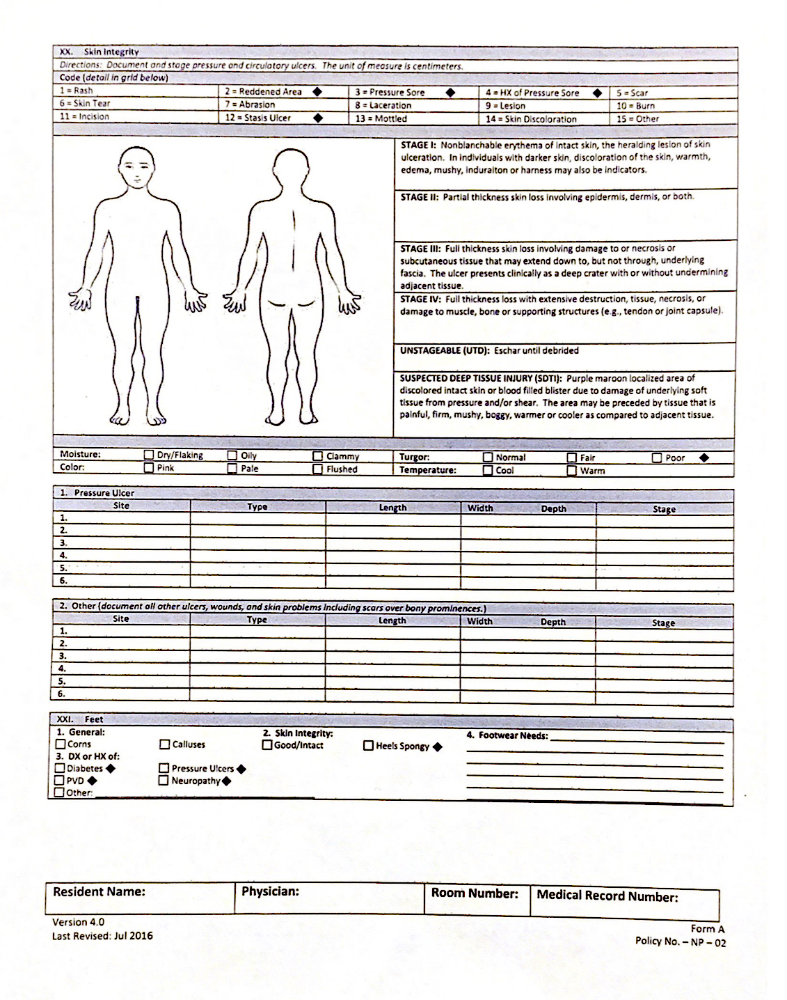
(Click here to see all the forms Treatment Nurses have to fill out)
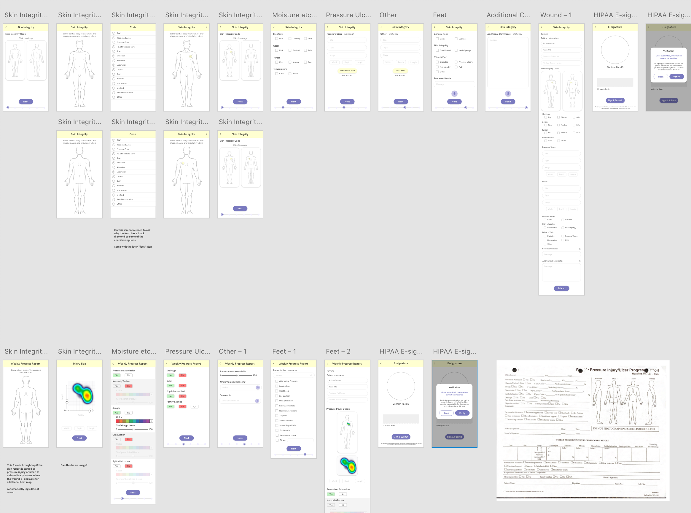
We used card sorting methods to inform how our app would prioritize and categorize information, and design a UI that would provide a relevant hierarchy of content. Our prototype also heavily relied on the already-in-place language frameworks and color tagging systems nurses use.
The technology was further leveraged to expedite the process. For example, Sova can auto-input information that removes the need for nurses to copy the same information on multiple forms. Furthermore, voice transcription APIs minimize time spent scrawling illegible notes that can lead to negligence in long term care. Finally, pattern recognition software can analyze anonymized data with the hope of eventually providing predictive care.
“Sova automates paperwork for treatment nurses so that nurses save time and can focus on providing effective care”
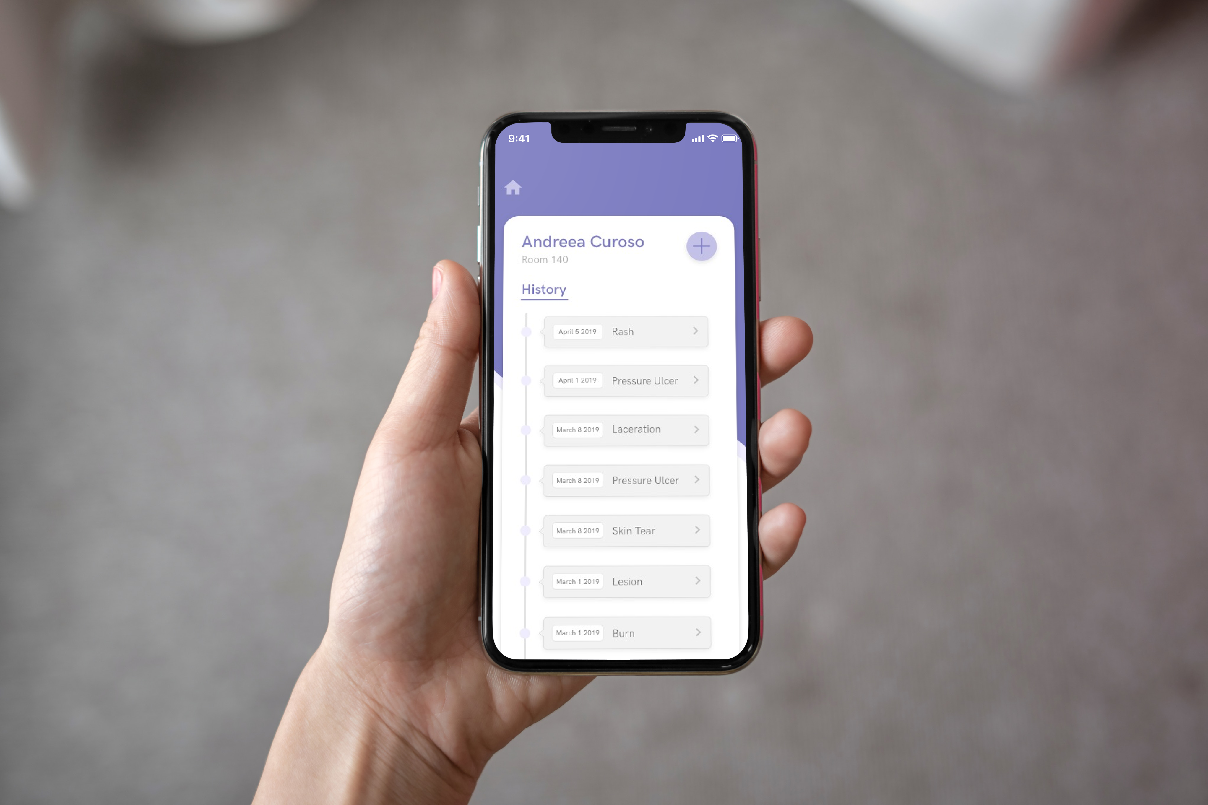
Before treating patients, nurses are required to look over patient info and care history, but they often miss critical information on forms. We thus designed patient cards with a hierarchy that provides relevant information and raise red flags (like medication allergies or patient conditions). Distilling down the information that is currently lost in filing rooms can mean the difference between life and death in some cases.
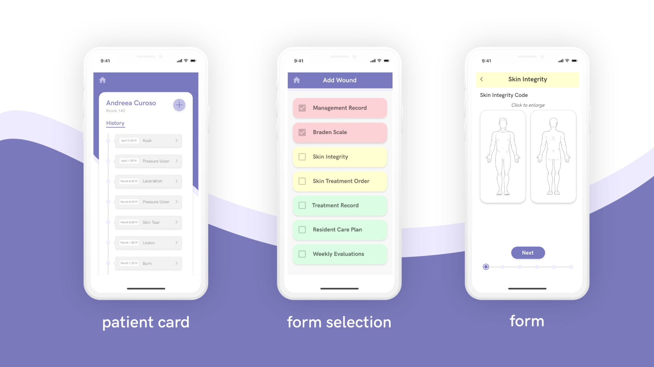
- Standardized icons increase the accessibility and transparency of info.
- Enriched media and auto-inputted information speed up the process while intuitive checklists make sure nurses don’t miss a step.
- Form headings are the same colors as physical forms to ease the nurse’s transition into a digital system.

The patient profile card exemplifies a lot of our learning insights that informed our user interface. Seeing as the first step nurses are required to take is look through the patient files, this was a chance for us to streamline the process by creating a hierarchy of relevant information.
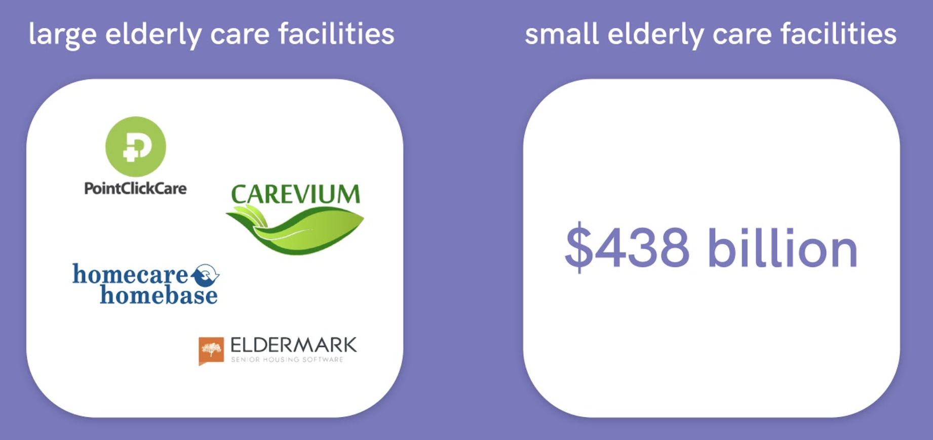
Market
Current competitors are not designed around nurses and are expensive enterprise solutions that only large scale healthcare facilities can afford. We are focusing mainly on the small scale facilities that can’t afford these platforms. Furthermore, these facilities are the fastest growing space with over 10,000 new facilities expected to be built by 2030.
Preliminary reflections
When entering the geriatric care space, my team had a vision, but limited domain expertise. With each day, however, we hustled to figure things out. The first week was filled with lots of dumb questions. I skipped a day of classes and camped outside the gerontology building to throw as many questions as I could to anyone leaving the building while also calling up authors from the gerontology magazine and emailing any experts in the field. The same process was to be repeated weeks later when we had legal and regulatory questions and I found myself outside the Gould school of law.
We also followed nurses on their routine and listened to many patients’ stories. Although we got barrels of insights, my biggest takeaway: carry a lighter and catch nurses on their smoke break because that’s when they open up the most.
Another weekend, I finagled my way into the Aging Into the Future conference at the LA convention center by getting in as a volunteer. I found myself spending most of my time at the tech support booth where most older adults gravitated towards and understanding a lot more about the digital literacy rates and limitations amongst this population.
Although every week was a new challenge, we slowly narrowed our goal towards a more tangible problem, and we found a better grasp of how we could approach this space. It felt like a scavenger hunt where we not only had to find an answer to the current problem, but we had to find the next question to ask and the next problem to approach.
We are working on potentially pivoting our product or re-shifting our focus to a space where we can apply a leaner approach. and focusing on a new industry. We see Sova as a stepping stone into creating something much more impactful and as an opportunity to ask ourselves “What problems is our team best suited to solve?”
For fun: I also learned how to use Adobe After Effects in order to create these animations
