This comedic problem came to me as I encountered the issue of reaching the bottom Pringles in person. And it wasn’t just me. Whenever I saw someone eating Pringles, the long, cylindrical design forced people to adopt a ritual that I half expected a laugh track to play over. Most people would harness the power of gravity, tilt the can towards them, and let the chips slide down to the opening. Then, some people would act fast enough to maneuver the can in time, while others would wait till too late, watching as a pile of crumbs cascaded onto their lap. Overall, it is a site to behold, and it begs the question: can design be used to solve this trivial problem?
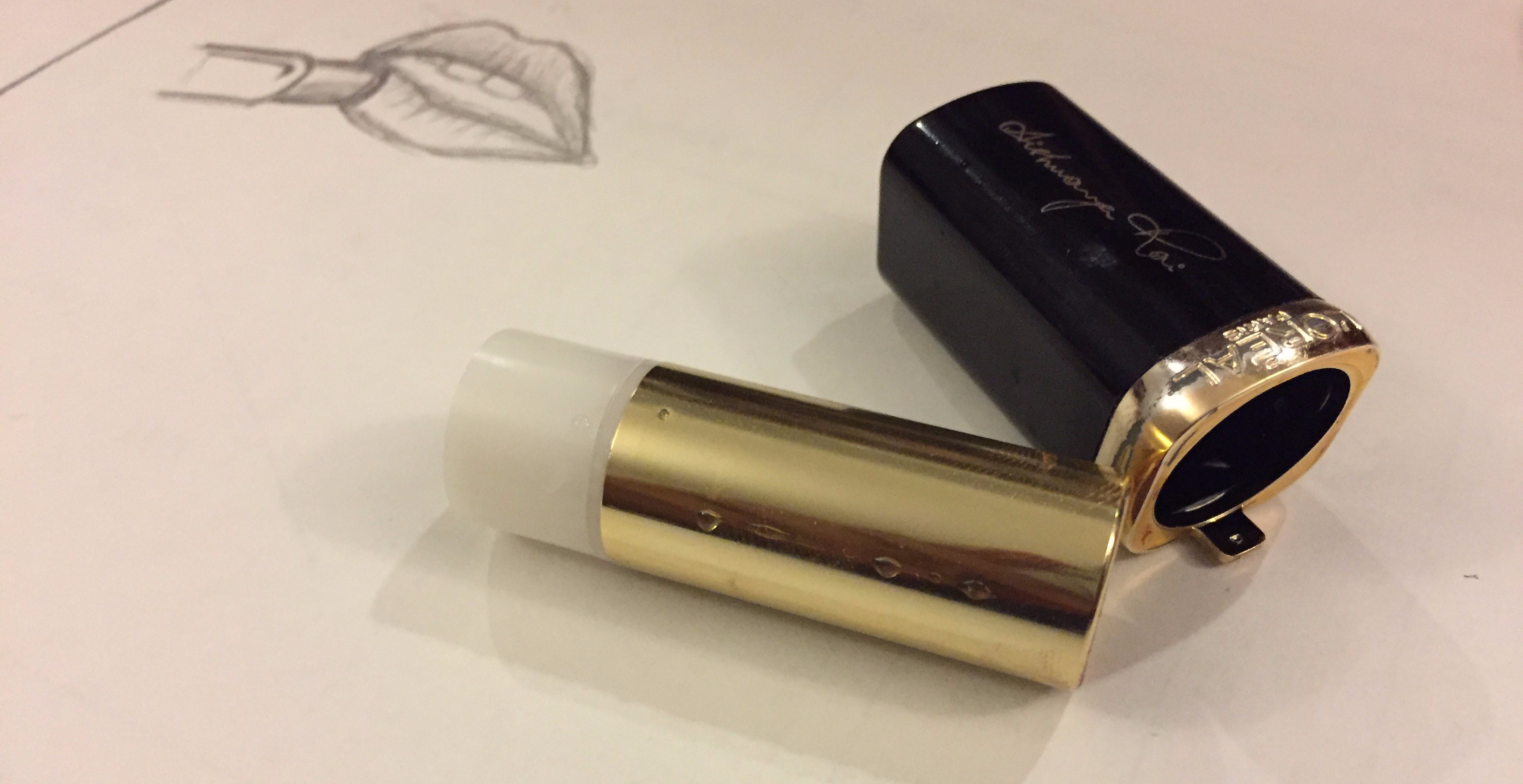
The answer came to me as I was sitting in the metro and I watched someone apply lipstick in front of me. I had been thinking up solutions in the back of my head, and immediately the two clicked. Just like the lipstick that can be rotated out of its housing, the Pringles could also easily be outfitted with an adjustable bottom platform that could rise up and down.
I spent some time taking apart lipstick canisters and understanding how they worked, and the solution seemed perfect for Pringles as well.


The idea was a simple solution, for a simple problem; nevertheless, it still felt satisfying to be able to solve a simple user interaction problem. I find it absurd that Kelloggs hasn’t redesigned the packaging for one of the most badly designed items on supermarket shelves, but I assume it has something to do with the incremental costs a solution like this would have. Still, the solution I created intentionally stayed true to the distinctive, immediately recognizable shape of the Pringles can, while solving its biggest design challenge.
