
Homeward! Here are some insights from my journey through LAX.
User experience issues began to pop up before I had even arrived.

When searching for my flight’s terminal, Google, Lyft, and the LAX website all surfaced different answers. After getting off at the wrong terminal, I eventually found the correct result after navigating circuitously through the LAX website and walked to my correct terminal.
The notorious traffic at LAX led to a 15-minute ride from the entrance ramp to Terminal 2. Observing simple traffic patterns highlighted some obvious problems:
- All terminals use the same road; since traffic isn’t compartmentalized, every terminal’s traffic is combined. This means exiting traffic builds up by the last terminal. Bifurcating traffic and rerouting exits after terminals 1-3 + TBIT, and Terminals 4-8 could effectively cut LAX traffic in half.
- Buses create bottlenecks when they change lanes. A solution could be to reroute buses to a separate drop-off point or only allow them to use the lanes already dedicated to rental car shuttle buses on the ground floor.
Note: LAX does have a master plan to clear congestion which includes a people-mover, a consolidated rental car hub, and a future metro connection.

The large pillars on the sidewalk impeded pedestrian traffic, especially considering the already limited space left after car barries and the lines of trolleys. Instead, the car barriers that already take up space could support the roof. While taking this picture, I was afforded a brief moment where there wasn’t an awkward “you go, no I’ll go, oh sorry no you go” moment for people negotiating their route while dragging unwieldy suitcases.
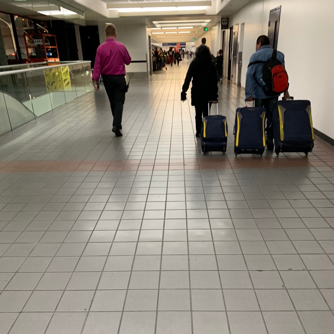
When choosing a floor for a newly constructed airport, do designers even consider the average traveler and the fact that s/he usually has a rolling suitcase? Sound design in airports is a massively overlooked part of the experience; hundreds of clacking suitcases created a cacophony of headache-inducing sound. (Sidenote: each golf cart inside the terminal also had a blaring ambulance-like siren. Seriously, is that the most effective way of getting through crowds?)

Airports generate a large part of their revenue from ads; advertisers have a unique platform to reach international audiences and target a fairly narrow archetype. All that doesn’t matter however when billboards can’t even be seen. This picture was taken with my arms above my head after leaving the check-in line. Most of the ad was invisible to the naked eye as I stood in line for 15 minutes, and it was an especially wasted opportunity to appease the advertiser stakeholders.

TSA is always the messiest part of the journey. As I waited in line, all the agents around me struggled to manage the influx of people as they constantly diverted passengers and changed the retractable queue-lines. Part of the problem was herd mentality. People were sticking to the first line leaving others empty. One solution could be to put small LEDs on the top of the queue poles to attract attention and guide crowds with flashing lights like a runway.
Another more equitable solution would be to consolidate the three lines into one. Although the line itself would be longer, the time taken to pass the line would actually be faster on average (one bottleneck passenger wouldn’t hold up an entire line). This would take up the same amount of space, and faster moving lines would give the illusion of a faster service. It’s also a lot easier for TSA agents to manage.
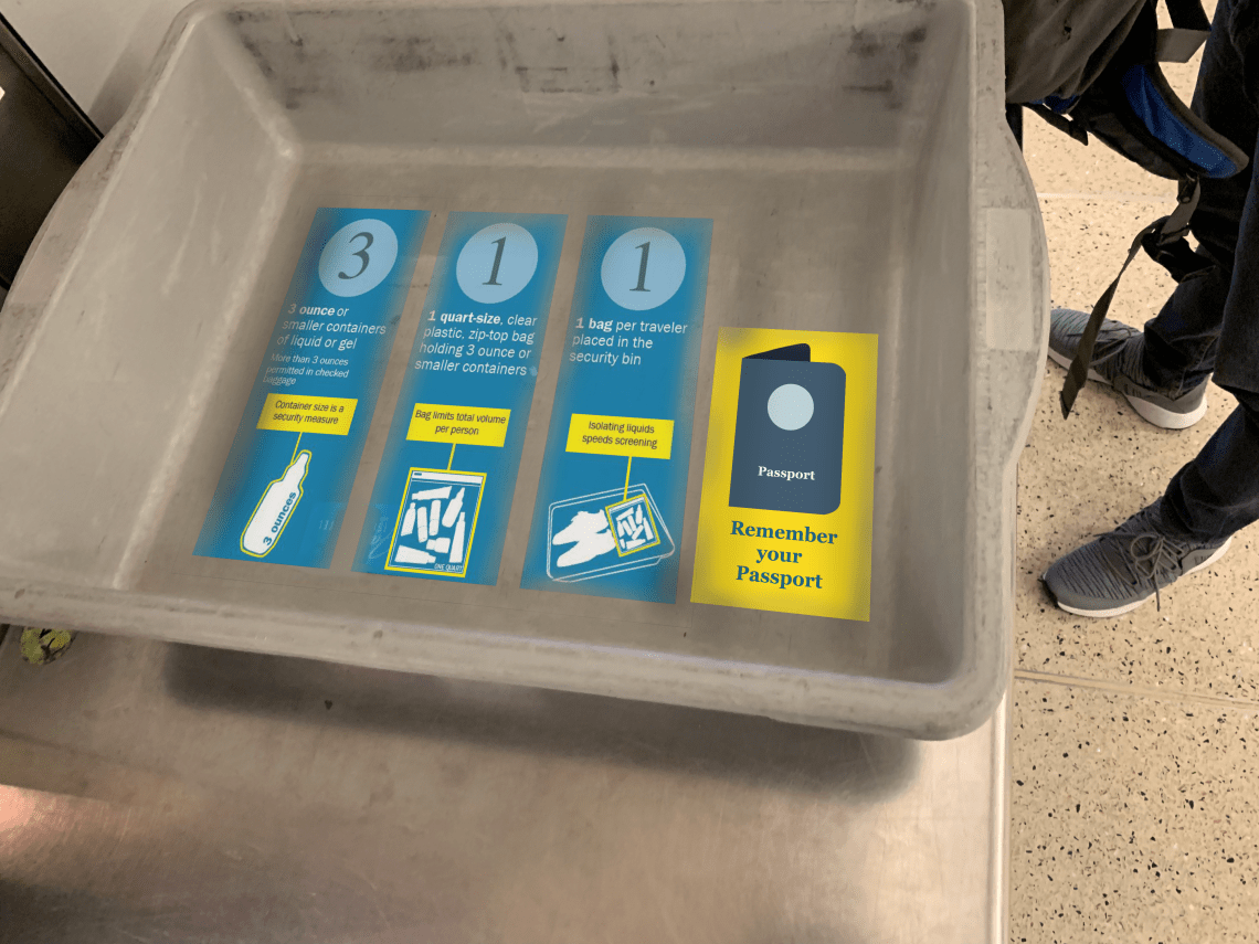
“Can I keep my shoes on?” “Do I have to take out my iPad?” “Am I allowed to take my passport with me?” All these questions are not uncommon at the TSA checkpoint. Why not include the TSA rules on the bottom of the tray? (note: invisible design).
I’ve also noticed many people (including myself on past occasions) forgetting the passport at the security check. This tray includes a reminder that stands out.
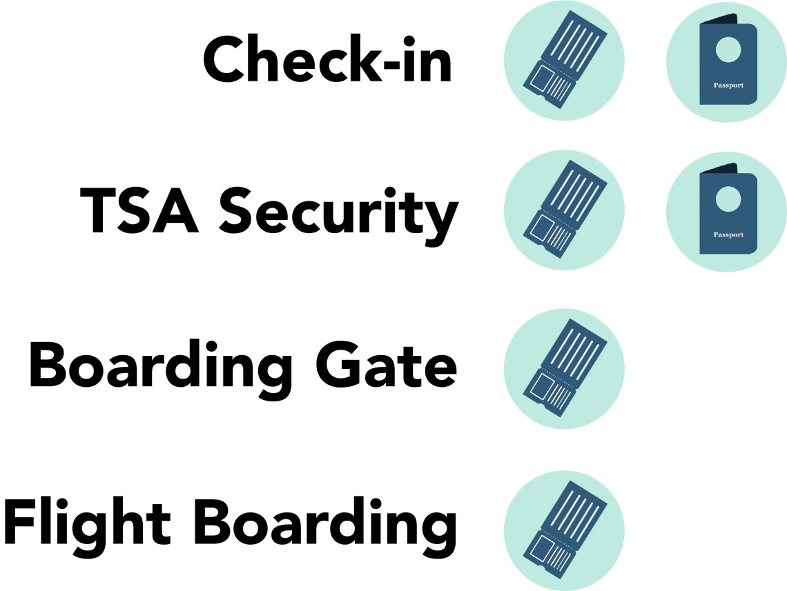
On that note, why is there so much unclarity regarding when I’ll need my passport, boarding pass, or both? Signs at each checkpoint should clearly indicate what documents are required. Even better, why not make the entire process transparent with indications of future checkpoints and their requirements. It would remove the hassle of repeatedly putting the passport into a bag and taking it out again.
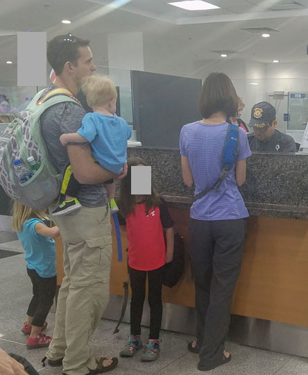
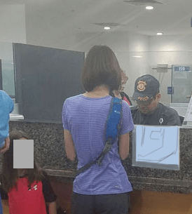
At my destination, immigration customs exemplified how universal design can enhance an experience. Whenever a family arrived at the desk, parents would have to awkwardly juggle bags and passports as they held their child up for the customs officer. Anticipating potential security constraints, what if there was a one-way window slit that allowed the officers to look down at children.
Some other thoughts I had:
- Travelers should be able to see the time from anywhere in the airport
- The screens indicating the gate numbers for flights should be sorted using some metric like time instead of the arbitrary flight number (which requires hunting around on your boarding pass).
- Instead of an entire shopping mall, why not include wellness areas for meditation, relaxation, etc. An oasis away from the noise of the airport.
- Travelators should include signage so that people don’t accidentally go beyond their gate and need to backtrack. Follow the conventions used by highway express lanes e.g. “Exit here for gates 5-8. Gates 8-25 ahead”.
